

Follow Lilach
Your Definitive Guide to Web Accessibility
Are you discouraging a sizeable amount of today’s internet users to access your website? Yes, we know. You strive to keep it updated. It boasts of latest designs. You’re very proud of it. And, you even spend a considerable amount of money towards its upkeep. In other words, you do almost everything to make it widely accessible except this. And in this blog post, you’ll find a definitive guide to web accessibility.
Your story is not too different from Margaret’s. She too used to do the same only a few months ago. She even spent a large sum of money to redesign her website early last year. And, she was very happy with the results until she discovered a completely different issue.
Owing to a string of coincidences Rose, Margaret’s teenage daughter, decided to spend a couple of months with her grandmother Martha at her holiday cottage. One evening as there was hardly anything for them to do after dinner, Rose thought of showing Martha some of her mother’s latest interviews with the celebrated artists of the country. She knew Martha too is crazy about art.
She opened her mother’s website, accessed the section which houses the interviews. Just as she was about to play one of the audios, Rose realised the mistake she has made.
None of the podcasts or videos had any transcripts associated with it. Unfortunately, Martha suffers from presbycusis, a common hearing problem associated with the advanced age. So there was no way for her to enjoy some of the most absorbing interviews on this website.
After listening to this story from Rose, Margaret realised how she has failed to provide a satisfying experience to every one of her website viewers. For the first time, she realised the importance of having an accessible website. And to her credit, she acted on this feedback promptly.
Your Definitive Guide to Web Accessibility
Web accessibility standards: A very brief overview
The first Web Content Accessibility Guidelines (WCAG) were published by W3C in 1999. WCAG 2.0, currently in practice, was adopted in 2008. It has three levels of compliance: A, AA and AAA (https://www.w3.org/TR/UNDERSTANDING-WCAG20/conformance.html#uc-levels-head) with AAA being the strictest of the three.
Why should your business care about web accessibility?
By having an accessible website, you encourage every user to seamlessly view, understand and interact with its contents. You’re no longer forced to reserve the benefits of the online services to a privileged few.
Just have a look at the following numbers and you’ll see for yourself why.
A report published early in the year shows, 9 out of 10 adults in the UK have recently accessed internet. Nearly 8 out of 10 from 65-74 years’ age group use the internet.
97% of those belonging to the 16-24 years’ of age group and suffering from some form of disability is an active internet user. This number is 34% for those over 75 years of age.
Besides, we cannot ignore the number of users temporarily constrained due to the crippling effects of certain diseases and injuries. Having an accessible website ensures you’re not excluding anyone from reaping the benefits of your products and services.
These are not all. In conforming to the standards,
- You automatically follow certain other best practices of developing and maintaining your online business.
- Your gain significant advantage in at least two other departments, namely, SEO and content marketing.
- You find your websites easier to maintain and consequently more cost-effective.
- Sites load faster, a factor which is crucial to search engine ranking.
- Use of unobtrusive Javascript ensures better usability.
- You find yourself better prepared for web accessibility compliance (accessibility may pretty soon be mandatory for the websites serving the audience from the UK and EU).
- Most importantly, it shows your commitment towards creating a positive customer experience.
[clickToTweet tweet=”Your Definitive Guide to #Web #Accessibility guest post by @DolaRC” quote=”Your Definitive Guide to #Web #Accessibility guest post by @DolaRC”]
How to build an accessible website?
Accessibility is not an add-on feature. Creating an accessible interface is integral to building a functional and purpose-driven website. However, developing an accessible website is not too difficult. The following steps would help you to build an accessible web presence for your business.
(1) Include image alt text
Suppose you’ve prepared a plate of delicious pilaf. Now you want to share the recipe along with its images in your latest blog post. Instead of simply saying “pilaf” in the alt text, mention “Rice pilaf with shrimp, feta cheese and cherry tomatoes.”
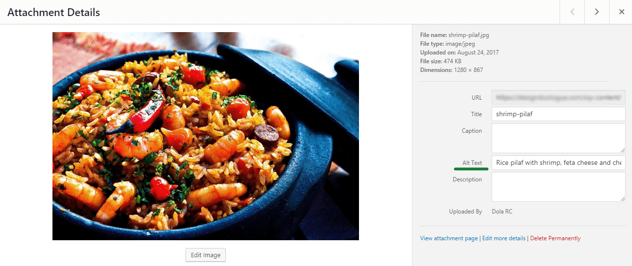
A descriptive image alt text helps readers suffering from visual impairments to understand an image’s thematic and contextual relevance. They generally use screen readers to go through your web pages. When image alt text is absent, the screen reader fails to describe the content.
And if you’re looking for any fringe benefits then let me tell you, search engine bots adore your posts as much as your readers.
(2) Follow good copywriting practices
Good copywriting practices contribute a great deal towards better web accessibility.
- Let your content be easy to understand and concise. Ensure a logical flow.
- Avoid cliché and repetitive words. Nothing else makes your copy more boring and convoluted.
- Keep your readers’ interests in mind. They’re spending their valuable time to go through it.
- Vary between short and long sentences. Treat your paragraphs the same way.
- Use bullets to highlight the key points when necessary.
- Maintain a friendly tone to form a lasting relationship with your readers. For some more tips on the subject, read this.
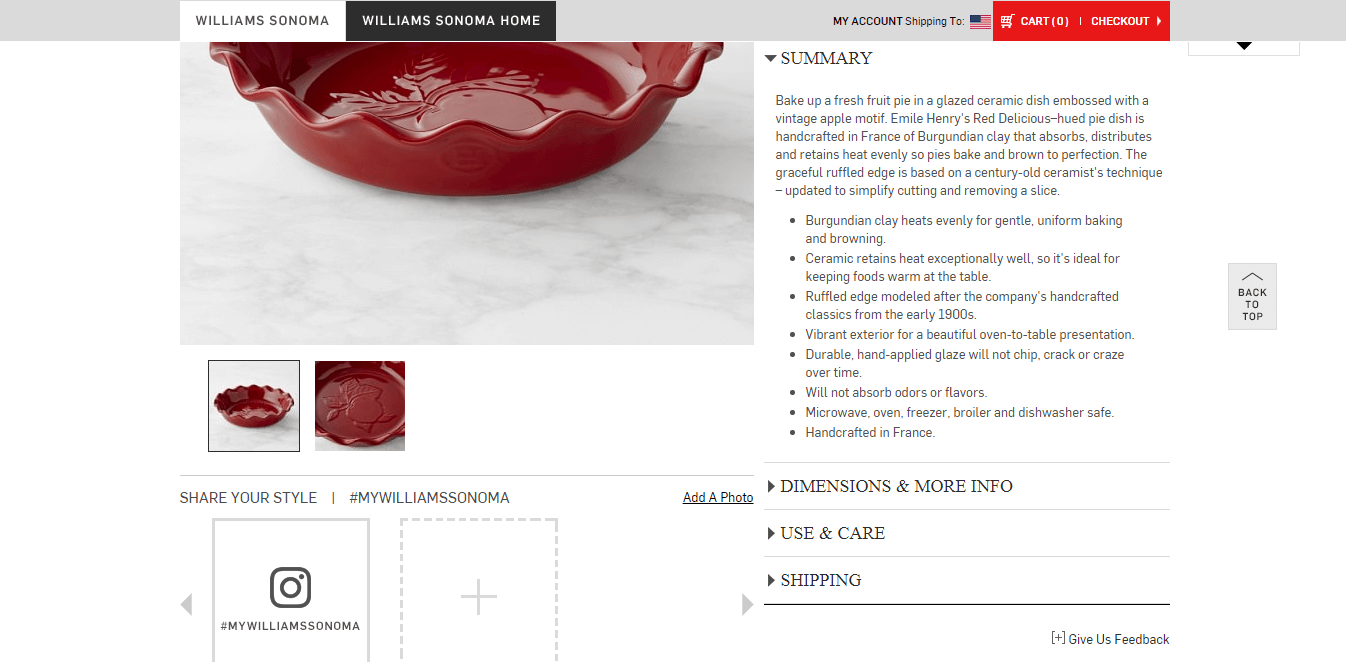
Check your product page. Find out if your buyers are getting all the necessary information about the items on sale. Don’t leave them with the mere image of a product. This massively helps your potential customers and improves your search engine ranking.
Suppose you’re selling dinnerware. Mention the material, size, colour, origin of the item and care information (if the product could be used in microwave/dishwasher) in each case. Don’t leave anything to the viewer’s imagination.
See how Williams Sonoma describes every product in greatest detail on its site:
(3) Be consistent with the layout and structure
Have you noticed how every page on this website is clearly divided into three sections: Header, body of the main content and footer? Make sure you’re also having a similarly consistent and easily distinguishable structure across your website.
- One very easy way to add meaning to your markup language is to use ARIA (Accessible Rich Internet Applications) Landmark Roles. Assistive technologies use them to steer the readers through your website.
Now, relax! Don’t get annoyed by all these dev talks. This is going to be taken care of by your developer. But a simple knowledge of the same makes a difference.
- Use appropriate section headings to mark the beginning and end of the various components of your page.
- Utilise hierarchical and semantic HTML tags to clearly define the page outline. For instance, you may set the top level section heading as H2 throughout the website. According to their hierarchy, tag subsequent headlines with H3, H4 and so on.
- Even when using a WYSIWYG editor, determine on a layout and stick to it.
Now – here is another important part.
An eye-tracking study conducted by Nielsen Norman Group in 2006 revealed that readers are tempted to follow an F-shaped viewing pattern while reading from the web. After spending a reasonable amount of time reading the headline and top two paragraphs, readers tend to quickly glance through the content vertically.
Choose a layout that closely matches this viewing pattern or generate heatmaps to decide on one that works best for you.
In his 100 Great Copywriting Ideas, Andy Maslen warns,
“Just be aware that the more obstacles you put between your reader and their comprehension of your copy, the less likely they are to respond.”
Use design as well as content to keep your readers thoroughly engaged and entertained. People with some learning disabilities also find it easier to go through a long copy with excellent organisation. Let readers confidently move through your content without any difficulty.
[clickToTweet tweet=”Your Definitive Guide to #Web #Accessibility guest post by @DolaRC” quote=”Your Definitive Guide to #Web #Accessibility guest post by @DolaRC”]
(4) Beware of colours
Clever use of colour is key to the aesthetic appeal of a website. Yet, a sizeable number of people (an estimated 8% of men and 0.5% of women of Northern European ancestry), suffer from some form of colour-vision deficiency. Additionally, older users may face some challenges with certain colours. So colour should be used with great care.
WCAG 2.0 level AA suggests a minimum contrast between foreground and background colours to be set at 4.5:1 for small texts and 3:1 for large texts. To achieve AAA level compliance you must have the same at a minimum of 7:1 and 4.5:1 respectively.
Texts on images should also have similar ease of readability.
A well-defined and tested colour scheme helps you to reduce any accidental mistakes in choosing colours.
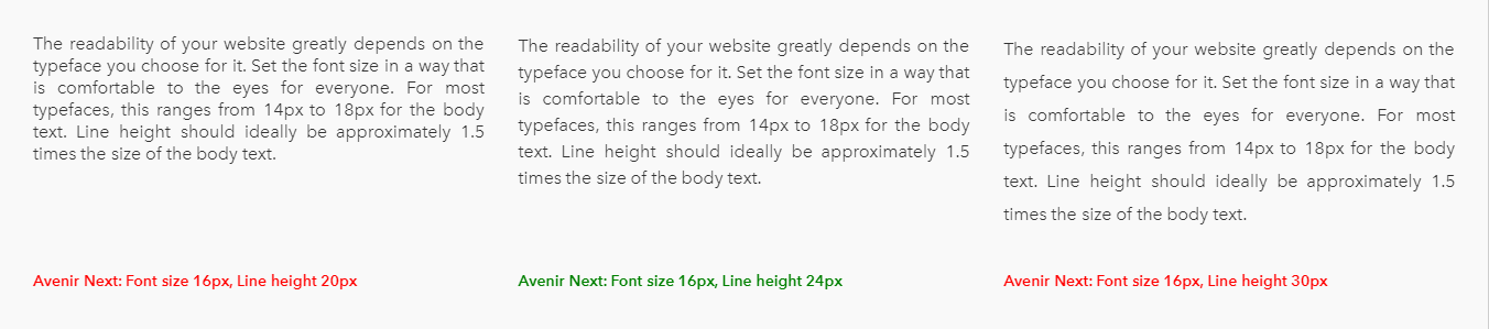
(5) Focus on typography
The readability of your website greatly depends on the typeface you choose for it. Set the font size in a way that is comfortable to the eyes for everyone. For most typefaces, this ranges from 14px to 18px for the body text. Line height should ideally be approximately 1.5 times the size of the body text.
In The Elements of Typographic Style, Robert Bringhurst recommends a column width of 45 to 75 characters with the sweet spot being around 60. (Please note that these specifications are applicable to Latin-based languages only)
Include ample white space around the text to let it breathe. These simple steps go a long way to keep your readers hooked to your content and not feel claustrophobic.
Do not disable the page magnification function.
In the following image, you can see how the combined effects of font size and line height affect the readability of the content.
(6) Use recognisable links
Links are one of the most fundamental elements of a website. Take care to make your links descriptive and easily identifiable. Instead of saying, “See my latest photos with my pet cats here (link 1), here (link 2) and here (link 2)” say, “See my latest photos with my cats on the terrace (link 1), in the kitchen (link 2) and on the beach (link3).”
To make your links stand out, you may or may not use underlined text in combination with colour. But avoid having two consecutive links without a word or phrase between them.
Blue happens to be the default choice of colour for links. As opposed to red and green, blue links remain identifiable to those affected by common colour-vision deficiency.
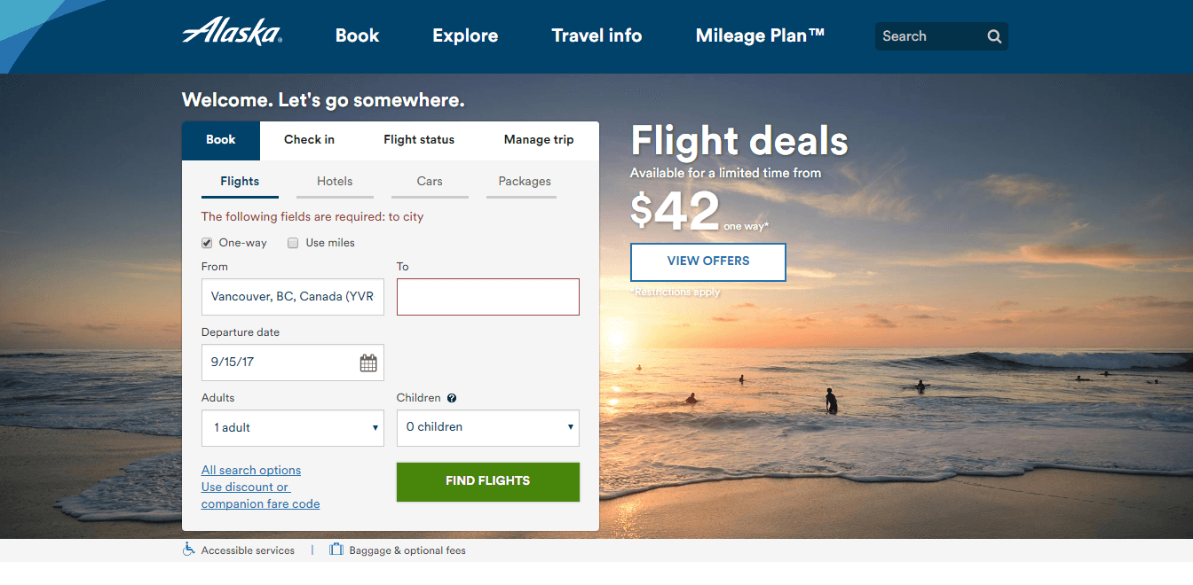
(7) Optimise the form elements
Are you using forms to seek feedback about your newly launched products? Encourage your readers to sign up to your newsletters? Or, perhaps simply get in touch with you? Hope you’re not scaring off your readers with another of those dull and super lengthy forms. Just to avoid this kind of debacle make sure to,
- Ask for the most relevant information only. For example, if you’re selling digital products do not ask for physical addresses.
- Group the related fields together and maintain a logical flow.
- Have clear and descriptive labels. Don’t rely solely on the placeholder text. They not only disappear as you start typing in, but they’re not always read by assistive tools.
- Provide real-time validation and contextual error messages on entering wrong information.
- Insert CAPTCHAs with visual and auditory controls.
See Alaska Air’s super simple and keyboard friendly form design for inspiration.
(8) Embrace striking button designs
You use buttons to entice your readers to follow and share your articles, play or pause podcasts and videos or allow them to add products to the cart. They’re omnipresent elements of your website. You want them to be as click-worthy as possible. Don’t you? So focus on,
- Their visual appeal. Make them stand out. Follow the same standards while selecting their colours as discussed in point #4: Beware of Colours.
- Succinct labels. Mention what would happen once the user clicks on the button.
- Different states of a button: Active / Inactive, Hover, Focus, Pressed.
- Optimally sized buttons. This makes them touch device friendly. Apple recommends a minimum target size of 44px X 44px.
[clickToTweet tweet=”Your Definitive Guide to #Web #Accessibility guest post by @DolaRC” quote=”Your Definitive Guide to #Web #Accessibility guest post by @DolaRC”]
(9) Add controls to the moving elements
Do you use animated elements on your website? Have fast moving carousels or auto-playing videos on a loop? Do you let your viewers play or pause them at will? If not, try to add these controls whenever possible. Also, introduce these features sparingly.
Make sure no website elements flash more than thrice per second. People suffering from dyslexia, epilepsy and various cognitive disorders find the moving, flashing, blinking or flickering elements highly disturbing.
(10) Introduce clear navigation
Poor navigation tends to put off a lot of viewers. Lead them to the source of the information quickly and in as few steps as possible. To have a fantastic effect on your conversions:
- Group similar items neatly in one category. So if you’re selling women’s clothing, consider grouping your items under party wear, beachwear, formal wear and so on.
- Make labels easier to comprehend.
- Place menu items in predictable areas of your site, such as header or left sidebar (for all left to right scripts).
- Check if your website navigation satisfies these two questions: “where am I” and “how can I go to my destination.”
(11) Support keyboard-only access
The keyboard is the sole input method for those who find the use of mouse, trackpad etc uncomfortable. Allow them to:
- Access the various parts of your website by using keyboard only.
- Skip to the main navigation, content and footer.
- Tab through your website without getting trapped anywhere.
- Scroll through your website at their leisure. In other words, avoid scroll hijacking.
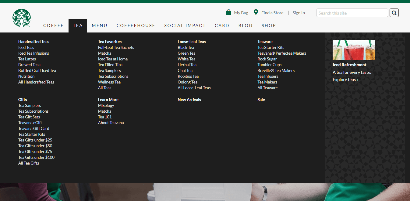
See how you can surf through the entire website of Starbucks with your keyboard. Their website navigation is also something to take a cue from.
(12) Add transcripts for audios and videos
The popularity of internet videos is growing at a rapid rate. Cisco believes, fondness for video content will continue to increase at a rate of 32% over the next four years. No doubt, videos have started to become the preferred type of content for many marketers.
You may also have other motivations for adding videos and podcasts on your website. But while doing so, just ensure you’re not repeating the same mistakes made by Margaret earlier.
Try to add transcripts of the audio or video content and synchronised captions for non-live videos. Check out how the popular online learning platform Lynda.com uses transcripts with sequential highlights to assist new learners.
This might be an expensive and a tad time-consuming activity at the moment. But it matters a great deal to make your valuable content accessible to all.
Which tools can you use to test website accessibility?
Luckily, there’s no shortage of easy and free-to-use tools to test website accessibility. Following are some of the tools that you can use to run periodic accessibility tests of your website.
- WAVE by WebAim is one of the most frequently used tools for this purpose. They also have Chrome and Firefox extensions to check any website right from your browsers.
- Celebrated Front End Developer, Author and Speaker Lea Verou have this playful colour contrast ratio checker on offer for all of us.
- Paletton’s vision simulation tool tells you how your colour scheme appears to someone with colour-vision deficiency.
- Nowadays, we often use texts on images to pretty up our content. To check the readability of your text on an image, consider using this tool.
Another cool way to audit any site for accessibility is to use the Chrome’s developer tools. Here are the steps:
- Open your website in Chrome.
- Press F12 (Cmd + Opt + I on Mac) to open the developer tools.
- Navigate to “Audits”.
- Click “Perform an Audit”.
- Uncheck everything except the “Accessibility” option (you can, of course, run them all at once).
- Run the audit. You’ll get the accessibility score along with an extensive report about your site’s performance.
[clickToTweet tweet=”Your Definitive Guide to #Web #Accessibility guest post by @DolaRC” quote=”Your Definitive Guide to #Web #Accessibility guest post by @DolaRC”]
However, please note that tools, even the most sophisticated ones, have their limitations. While pushing for changes, make sure to use your informed judgement.
Maintaining an accessible website is an ongoing process. It hardly requires a large amount of investment from your end. You can always learn from the leaders of the field. Understand, this is not about adhering to any regulations, but creating an inclusive space where everyone feels welcome.
About the author
 Dola is a copywriter and co-founder of Design Duologue, a full-service digital agency. She helps businesses develop compelling and goal-oriented content. On a personal note, she’s a trained artist with a keen interest in art history. To stay updated with her latest work follow her on Twitter.

Follow Lilach