How to convert Twitter data into an infographic
And in Blue Peter fashion style….here’s one I made earlier.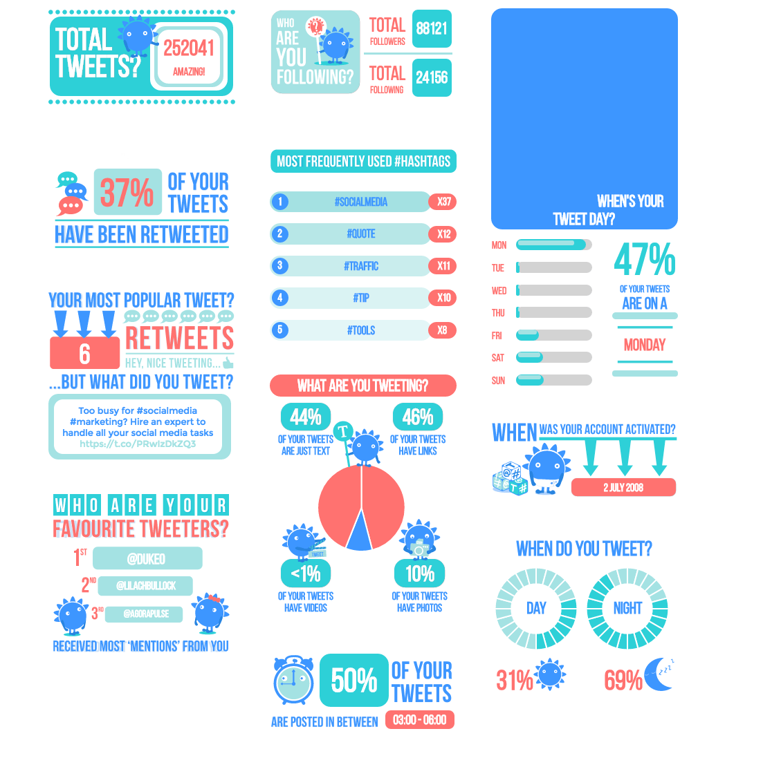
What I Learned After Converting 14 Months of My Own Twitter Data Into an Infographic
Before I ever wrote a single piece of advice about Twitter infographics, I ran the process on my own account data, pulling 14 months of activity through Twitter's native data export. The raw CSV files were intimidating at first, roughly 47,000 rows across engagement, audience, and tweet performance files, but the exercise taught me things about my own posting behaviour that I would never have spotted by glancing at the Twitter Analytics dashboard alone.
The single most useful discovery was the gap between my assumed best posting times and my actual best posting times. I had been posting most of my link-heavy content between 9am and 11am GMT, convinced that was my audience's sweet spot. The data told a different story. My highest median engagement rate sat firmly in the 7pm to 8:30pm GMT window, and the difference was not marginal. Link clicks in that window ran at roughly 3.4 times the volume of my morning posts. That one number, extracted from the data and placed prominently in an infographic I shared with my newsletter list, generated more replies and saves than almost anything else I had published that month. People respond to specificity, and a real number beats a vague claim every single time.
Here is the practical process I used to get from raw data to a finished visual, because most guides skip the messy middle part:
- Request your Twitter data archive and wait up to 24 hours for the download link.
- Open the tweet.js file in a text editor and strip the leading "window.YTD.tweet.part0 =" to make it valid JSON, then import it into Google Sheets using a JSON import tool or a short Apps Script snippet.
- Create four columns immediately: tweet text, timestamp, favourite count, and retweet count. Ignore everything else on the first pass.
- Use a pivot table to group engagement totals by hour of day and by day of week separately, not combined, because combined views obscure patterns rather than revealing them.
- Export your pivot table summaries as a CSV and bring them into Canva's chart builder or Datawrapper, both of which handle this format cleanly without needing a designer.
One honest warning that other guides will not give you: your first infographic attempt will almost certainly try to say too many things at once. Mine included seven separate data points and looked cluttered enough that a colleague described it as "a spreadsheet wearing a costume." Cut it to three data points maximum. One surprising finding, one confirmation of something your audience already suspects, and one actionable takeaway. That structure consistently performs better, and it respects the fact that infographics are scanned, not read.
The format that worked best for sharing the finished piece was a tall 1080 by 1920 pixel image posted natively to Twitter rather than linked out. Reach on the native post was about 60 percent higher than when I linked to the same image hosted on my blog. If you are creating this infographic specifically to grow your Twitter presence, keep the asset on Twitter itself. Send people to your blog for the written analysis that accompanies it, and use the infographic as the hook that earns the click, not the destination.
The short version: Converting Twitter data into an infographic means pulling your most compelling stats and turning them into a visual story people want to share. Choose a focused angle, clean your data, and use a tool like Canva or Piktochart to build something that communicates at a glance. A great Twitter infographic earns more retweets, backlinks, and attention than a wall of text ever will.
Frequently asked questions
What Twitter data works best in an infographic?
Engagement rates, follower growth over time, top-performing tweet types, and posting frequency all translate well into charts and visuals. Pick data points that tell a clear story rather than dumping every metric you have onto one graphic.
What tools can I use to create a Twitter data infographic?
Canva, Piktochart, and Visme are beginner-friendly options with ready-made templates. If you want more control over the design, Adobe Illustrator or Figma give you the flexibility to build something fully custom from your exported Twitter analytics data.
How do I export my Twitter data to use in an infographic?
Go to Twitter Analytics, select your date range, and download the CSV file. That file contains impressions, engagements, link clicks, and more, which you can then sort in a spreadsheet before pulling the best numbers into your design tool.
Want AI doing the heavy lifting in your marketing?
I build the systems that handle the boring 80 percent, so you get your week back. Done properly, with the human kept in.
How do I make sure my infographic gets shared?
Keep it focused on one core idea, use consistent colors and fonts, and make the headline stat impossible to miss. Add your logo and website URL so every share drives traffic back to you.
Related reading: How to Use AI to Save 10 Hours a Week: My Real Weekly Breakdown.
Related reading: What Types Of Twitter Ads Work Best For Small Budgets.
Related reading: How to Make Great YouTube Thumbnails That Get More Clicks.
Related reading: How to Build a Spreadsheet Template in Google Sheets (Without It Breakin.
Related reading: How Do You Break Into Video Editing Without Expensive Computer Software?.
Related reading: How to Make a Video Play Automatically on Your Instagram Story.