Follow Lilach
Seven things to remember when you’re designing a leaflet for print
Whether you are creating a leaflet to promote your services or need to get vital information across to your audience, it is important to get it right at the design stage. Here we take a look at seven key things that you need to remember when creating a printed leaflet from the importance of ‘bleed’ to choosing the right font.
-
Understand your goals
When you are designing a leaflet for print, the first thing that you really need to understand is: what is the purpose of the document? Think about who the target audience is and what you are trying to get across – while these things obviously inform the content, they can also inform design choices such as colours, fonts, and images.
Of course, your leaflet needs to retain your brand identity, but it is also vital to create printed materials that are actually going to be read by your target demographic.
-
Source high-quality images
Nothing will turn off people from reading your leaflet quite like low quality images that are pixelated. It just looks tacky, unprofessional, and unpleasant on the eye – lowering how people think about your brand. That’s why it is so important to source images that not only look good, but are large enough to print well.
Lower resolution pictures might look fine on your computer screen, but you have to think about the final product. How will the leaflet look when it is printed? If your current images aren’t 300Dpi and of high enough quality, then choose new ones.
“Put something real into the hands of your audience. Forget social media, MMS, and email and get back to marketing basics with a flyer. From promotions and special offers to announcements and sales, a well designed (and printed) flyer can change minds.” YouLovePrint
-
Include bleed
Unfortunately, this is something that gets forgotten by many people without much experience designing leaflets. The bleed is defined as: the section of the poster design that is trimmed off when the leaflet is cut to its final size. Including bleed is important, because it is inevitable there will be slight differences in where each leaflet is cut, so you need to provide a little extra space around the design so that you aren’t left with an unsightly white border.
It is always best to think about bleed and include it within the design so that you aren’t having to come up with a makeshift solution later on in the process.
-
Avoid too much colour
Using bright colours on leaflets is something that is best done sparingly. Yes, bright colours can be bold and eye-catching, when used effectively, and that’s not something that you shy away from. However, you need to be aware that when over-used, bright colours can actually put people off as they can be harder to read and simply too busy.
It is especially important when you choosing colours for your text to select a dark colour on a light colour. You might be tempted to make your leaflet look different to stand out from the crowd, but ultimately this is just going to result in people not actually reading it.
-
Don’t overload it

This point follows on from the last. It can be easy to get carried away in the design stage of your leaflet as you try to create a document that packs in as much information as possible. While you want your leaflet to be informative and helpful, if you overload it with too much text and details, it can actually make it confusing and impossible to take in for the reader.
Try to keep your leaflet to as few major points as possible, allowing more space on the page so that it doesn’t look too busy.
-
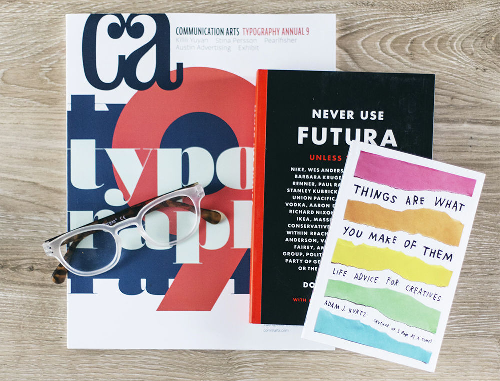
Think about font
It is important to remember that ultimately your leaflet is going to be printed, so the decisions you make have to be done with that in mind. Font is a big issue here – firstly, ensuring that you choose a font size that makes your text easy to print and fully legible, but also to make sure you are choosing a font that is easily readable.
-
Proofread, proofread, proofread
The last thing that you want to happen is to receive your leaflets from the printers and then immediately notice the spelling mistake in the first line. There really is no excuse for issues with spelling and grammar in your final document – make sure that you proofread very thoroughly and get another pair of eyes to do it too.
According to recent statistics, more than 59 per cent of British people are put off working with a business if they notice poor spelling and grammar. This shows just how important it is to get this right.

Follow Lilach


