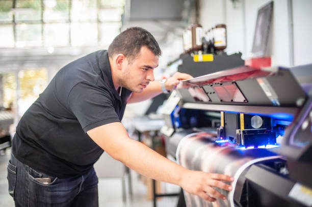


The print should be as good as your art, as you spent hours on the artwork. The most annoying prints are due to file issues rather than printer issues: blurry edges, dull colors or cropped corners. Most of them can be corrected with a little preparation. This is a guide to help you prepare your artwork and have your posters look exactly the way that you had envisioned.
Start With the Right Source Image
The higher-quality the file you begin with, the higher quality your print will be. The best base is a scan or photograph made under good, even lighting conditions. Don't take photos of paintings in shadowed, glaring, or angled light. In digital art, start at a big size, as it is easier to make smaller than larger. If you only have a small phone photo, please take another one or scan the original before ordering.
Understand Resolution and DPI
Resolution is the number of pixels in your image; DPI is how densely those pixels are packed when printed out. The usual goal is to get to 300 DPI at final print size. This means that an 18 x 24 poster requires approximately 5400 X 7200 pixels to be as sharp as possible. Sometimes, bigger posters viewed from a distance can look just as good with a bit less, but smaller files blown up to large proportions become soft and blocky. Many artists find that poster printing works best when they check the pixel size of their file against the print size before ordering. Don't use software that just increases the size of an image, as that can't add real detail.
Choose the Right Size and Aspect Ratio
Posters are available in standard sizes and each of them is shaped. When you print your artwork, the printer may have to crop your artwork or pad with blank artwork borders if your artwork ratio differs. Determine the size you want and create a canvas of that size. Make sure you leave ample room around key elements such as text and signatures so that they are not cut off. First, look at the size options for the printer, and let the compositions be made around the size of the printer and not at the end.
Pick a Good File Format
Avoid a format that compromises quality. TIFF and high-quality PNG preserve all the details, sometimes a high-quality JPEG is acceptable if saved at maximum quality. A flattened PDF might be useful for designs that include text. Do not save the same JPEG file more than once, as additional save operations may add minor defects. Use a multi-layered file, like a PSD, as a master file, and export a flattened copy for printing. Look into the guidelines for the printer to see what formats it will accept and how much files can be too big.
Manage Color So Prints Match Your Vision
Colors don't always appear the same when displayed on a screen or reflected on the paper. Lots of files are generated in RGB, and some printers switch to their color profile. If your printer provides clear directions, ask them which color setup they like to use and follow that direction! If possible, set up your monitor to be calibrated, and don't look at your art with too high or too low a brightness level. Bright neon and deep black colors are the most difficult to reproduce, and there may be some minor variations. The best way to determine what your colors will do on paper is to order a sample print.
Want AI doing the heavy lifting in your marketing?
I build the systems that handle the boring 80 percent, so you get your week back. Done properly, with the human kept in.
Think About Paper, Finish and Borders
When performing a printout, the paper changes the personality of a print. A matte surface is good for subtle, painterly work and for reducing glare. Glossy finishes emphasize colors and complement graphic designs. Textured papers create a handmade texture. If a white border is desired around artwork, add it into your file or inquire about border options. Use the inner edge of the print for some prints to provide key elements some clearance from the edge of the paper, particularly if you will be framing the poster.
Run a Final Pre-Print Checklist
Take some time to look over your file before uploading. Check for dust, scan lines, or stray marks by zooming in to 100 percent. Check the size, resolution, and format. Spell any text. View the image on more than one screen. Save a backup copy. Use a proof/sample if the printer provides one for the first order.
Conclusion
It all begins with a great file, and a great poster follows. Get your artwork in sharp, high-resolution, size, ratio, and quality format, and monitor for color and paper quality. Check all before you upload, and think of a sample for new designs. These tips will help you get sharp, colorful, and wall-ready prints.