

Follow Lilach
12 Ideas to Drastically Improve Your Homepage
Just about everyone who visits your website will see your homepage first. That’s because, in the digital world, your homepage is much like a storefront. If you’re walking down a street window shopping, you probably won’t go into a store with peeling paint, a worn-out sign, and cobwebs in the window corners. Similarly, if you have a confusing, unprofessional, or otherwise unappealing homepage, visitors aren’t likely to stay and explore your site.
But before you start creating your homepage, you need to think about what you want. If you’re like most website owners, you want site visitors to spend more time on your website and explore your content, products, and services. And the best homepages are inviting without being pushy–they gently encourage site visitors to venture deeper into your website. You can do this by suggesting your site has valuable information or products they may need.
Regardless of what your website is centered around, a thoughtfully-constructed homepage is a must. Here, we’ll guide you through the 12 main components you need to design a successful homepage.
1. A professional, eye-catching logo
Your logo is one of the essential parts of your homepage. First off, it helps encourage brand recognition, which is especially important when brands have a presence across multiple social media sites. A memorable logo lets your customers recognize your brand even while not on your website.
When designing your logo, erring on the side of simplicity is almost always a great choice. Most companies are now trending towards sleek, minimalist logo designs, and a logo with too many words or colors is likely to look unprofessional. If you aren’t proficient in logo design, consider outsourcing your logo design to a competent designer.
2. A navigation menu
Have you ever visited a website, only to be completely unsure of where to go next? A great-looking homepage is one thing, but if visitors can’t figure out a way to easily navigate your site, it can’t perform its intended function.
How you choose to implement your navigation menu is up to you, but it’s generally a good idea to make it visible enough that site visitors can see it easily. One common choice is to have menu buttons across the top of the homepage. Another more space-saving option is a drop-down menu. Either way, making it easy and intuitive for visitors to navigate your site is the main goal here.
3. A clear, catchy headline
A headline can add additional value and help inspire trust in your brand, even before visitors start exploring your site. What you choose as a headline will vary depending on your business type. Think of your headline as a slogan for your business. For example, if you run a disaster cleanup business, you might want your headline to include something about being there for your customers 24/7.
Here’s an example from BuzzSumo.com, a software company that helps you analyze content in whatever market you choose.
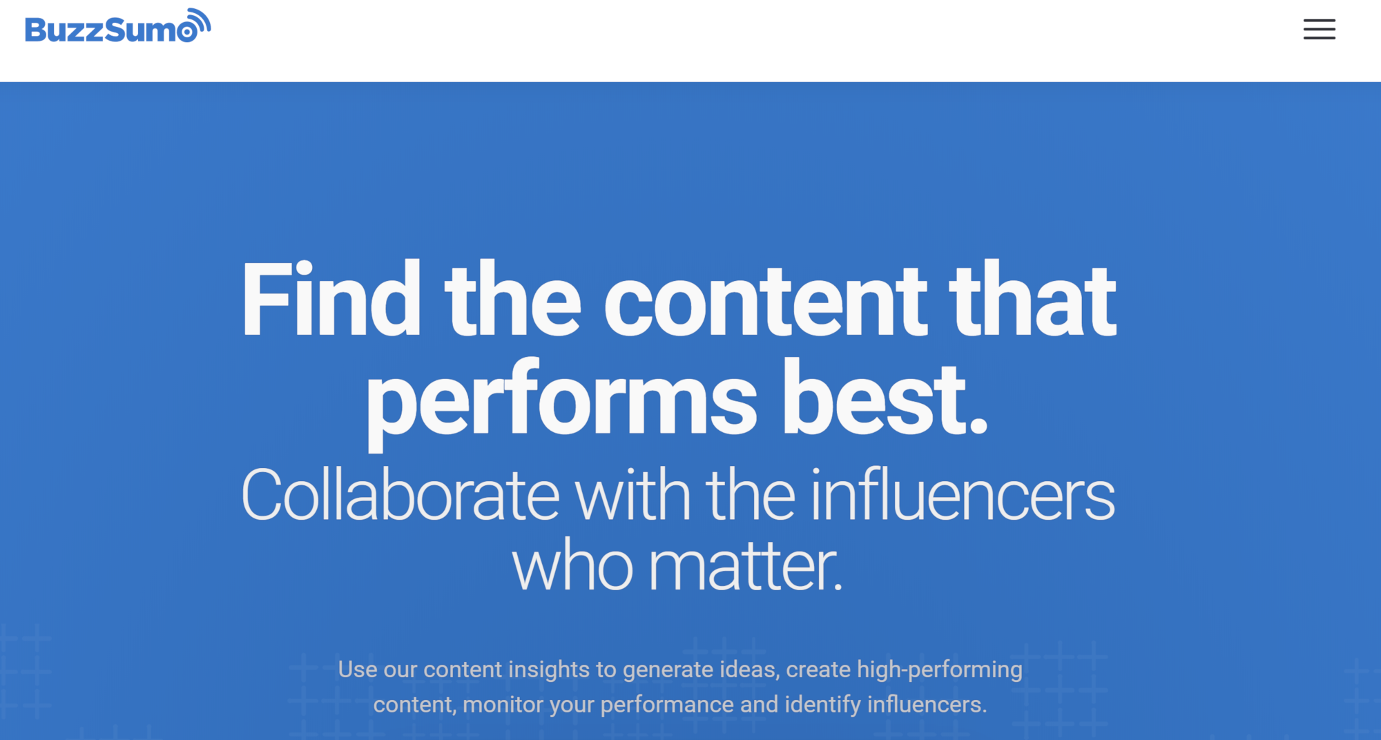
The headline, “Find the content that performs best,” perfectly sums up what BuzzSumo can do for its clients. Also, notice how succinct the headline is, with all extraneous words removed, what’s left is highly memorable.
When creating a headline, be sure to take your time–you want something clear and catchy without being gimmicky. If possible, run it by friends or contacts in the industry for feedback.
4. A hero image to grab visitors’ attention
A hero image is a large image you see across the screen when you visit most websites. And while it usually doesn’t involve much text content, it’s one of the essential parts of your homepage. Eye-catching, beautiful images, along with a professional-looking hero image, will inspire visitors to explore your site. Research has found that it only takes most people 50 milliseconds to form an opinion of your website, and a professional hero image makes it more likely that opinion will be favorable.
The good news is that you often don’t need to choose a single image. Many modern websites have a dynamic hero image, meaning that the image changes or rotates. A rotating hero image is a great way to get visitors to explore your site–you can link each image to a relevant page on your site. If you do this, it’s a good idea to have a text preview on each image.
Here’s an example of that in action from the Adobe After Effects site:

After Effects offers premier video design software, so it makes sense, they would want to showcase several visually enticing images on their homepage. Many sites use a video hero image that plays automatically instead of just an image.
Whether you use one image, multiple images, or a video, pair your hero image with a compelling headline, and you’ll gain instant credibility.
5. Social proof to help visitors trust your brand
We live in a social media age, and many people look to the opinions of others when making a decision. Because of this, it’s wise to have some element of social proof on your website. One obvious way to do this is through customer testimonials. Site visitors will able to see how your business has positively affected others, and this may motivate them to become customers, too.
But as the internet has grown, so have the number of ways you can include social proof on your site. One way is by showing the number of likes and shares your site (or a site page) has. Social shares show visitors that many other people have visited the homepage and reacted favorably. Another option is embedding social media posts. For instance, you may want to insert a relevant tweet. Directly from your site, visitors can then interact with the tweet.
You can also include any sites that featured you. For instance, if you’ve written a guest post for a top blog in your industry, you may want to indicate that on your homepage.
Here’s how Ahrefs.com, a search engine optimization tool, displays social proof on their homepage:
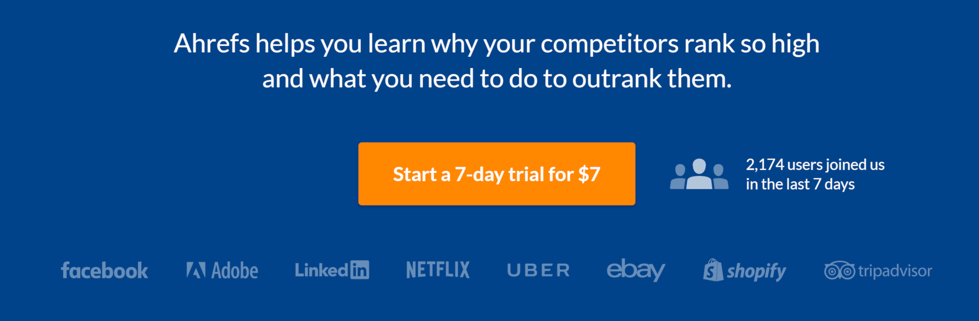
Next to their call to action is text stating the number of new users in the last seven days. As shown in the image, it’s well over 2,000. Any company that can get over 2,000 new users in seven days is doing pretty well, which is why they include that statistic right next to the button.
And yet another way to include social proof is through trust seals. These seals take up little space on your website, but they often mean a lot to visitors. Trust seals may indicate that your business is BBB accredited or that visitor data is encrypted. While they are a bit different from traditional types of social proof, including trust seals accomplishes the same thing that more conventional forms of social proof accomplish–it causes visitors to view your site as safe.
6. A call to action like an opt-in
Your website homepage might operate like your business’s virtual storefront, but it also needs to encourage your visitors to commit somehow–either by purchasing products, signing up for services, or just spending more time on your website. Creating a call to action that works is a fine line. You want to encourage customers to act, but you don’t want to come off as overselling your company.
Here’s one by StoryBrand.com, a marketing company, where visitors can opt-in to a webinar:

Once clicked on, the visitor goes to a form where they can enter their contact details and register for the next webinar.
Depending on your specific industry, your call to action will be different. If you offer a subscription service, you might want to include a clickable free trial button. Free trials are a great way to get customers to act, as they have an obligation-free way to try out your service.
Other examples of calls to action include buttons asking visitors to sign up for mailing lists, or even to buy a product now. And if your goal is to get visitors to explore your website, even a further “learn more” button is likely to encourage them to do so.
Some visitors may be hesitant to follow a call to action on an unfamiliar website. For this reason, it’s a good idea to keep your calls to action near your social proof. Visitors will see that other people have used your business and approve, and that will make them more likely to take the plunge.
7. A quick introduction
So far, many of the necessary homepage items we’ve covered are visual. And while you probably won’t have a massive amount of text on your homepage, it’s still a good idea to have a brief introduction.
Here’s an example from Brendon.com:

Brendon Burchard is a motivational speaker, so it makes sense for him to include a decent-sized introduction. That way, people get to know him better.
Of course, the exact style and what you include in your intro will vary. Yours may be much smaller. But generally speaking, following these guidelines will help you create a compelling and memorable introduction:
- Include engaging, vibrant copy. A dull intro isn’t likely to hold your visitors’ attention.
- Keep it brief. If you want to include an expanded introduction to your company, it’s best to have it on a separate “about us” page.
- Make your value clear. Connecting your business to your visitors’ daily lives will help them realize your business can benefit them, and they may be more likely to stay on the site.
8. A sampling of blog posts or other content
When you visit a news site, you usually will see clickable previews of relevant news stories on a sidebar. Of course, you don’t have to adopt this exact model for your site, but it’s an example of how including a sampling of your site content on your homepage can intrigue visitors. And since most website visitors stick around for under 15 seconds, giving them a preview of what else your site has to offer might inspire them to stay.
Knowing just how many previews to include may be difficult at first. A simple, elegant homepage is a must, but a homepage that’s too simple means visitors won’t know where to navigate next. On the other hand, too many previews and clickable elements can make your page look cluttered, making it less appealing to viewers.
Here’s an idea of how Foundr.com, a digital training company, does it:
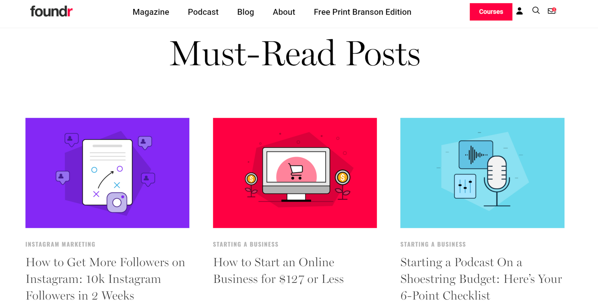
While there are just three images in the screenshot above, they show any row, so they’re showing six total previews. If you publish a lot of content, then six is probably the perfect amount of previews to show. Otherwise, three is another good option.
As you work on your homepage, try experimenting with how many previews of other types of content you want to include. And remember that you can have clickable links in a dynamic hero image.
To keep your homepage fresh, remember to rotate or update the pages you link to regularly (or just include the most recent content). Keeping your site updated will communicate to visitors that you’re involved and engaged in your business, and it may also encourage customers to come back to your site more often.
9. List the products and services you offer
Beautiful website design is essential, but if a visitor to your website doesn’t understand what you’re offering, they may be confused or choose to leave. And while this information is vital to include, remember that you can always elaborate on your products and services on their specific pages further down in your site.
Since the whole purpose of a well-designed homepage is to get visitors to explore your site more, all you need is a brief introduction of products and services. If possible, include a statement of value for each product or service. The statement doesn’t have to be elaborate. It can be as simple as stating how your product or service can make your customers’ lives easier.
You can also add in additional calls to action. For instance, you might include a brief description and a picture of a specific product, followed by a clickable “learn more” link.
10. A link to learn more about you or the company
Customers are increasingly interested in brand stories or how your particular company came to be. Including a brand story is essential for a few reasons. For one, it humanizes your company. Your brand story might mention the personal struggles you faced before finding success with your business, or it might show that your business is the result of a lifelong passion. Either way, a well-told brand story will help your website stand out. And since there isn’t enough space on a homepage to include a full brand story or section about you, make sure that you include a link somewhere on your homepage for visitors who may be interested in learning more.
11. Additional calls to action
Adding in more calls to action is optional, but if your website calls for it, adding more might encourage website visitors to visit more pages on your site. But like many elements of your homepage, you need to strike a balance.
If you’re having trouble deciding which calls to action to include, start by listing them in order of priority. Remember that, if you have an extensive collection of products or services, it may be easier to have a single “learn more” or “view products” call to action, rather than separate calls to action for each one.
12. A footer with more links and contact information
If you’ve ever had trouble finding contact information on a website, you know just how frustrating it can be. And since many sites include full contact information at the bottom of their homepage, most visitors will know to look for it here. Try to include as much contact information as possible. A phone number is useful to include, but a business-specific email address will encourage more people to communicate with you since they know they can send an email anytime.
Your footer is also a place to include more links. While you may have all the links you need in a drop-down menu or navigation bar, the space at the bottom of your homepage offers more space to include any links you weren’t able to fit.
Here’s how ConvertKit.com, an email marketing solution, organizes their footer:
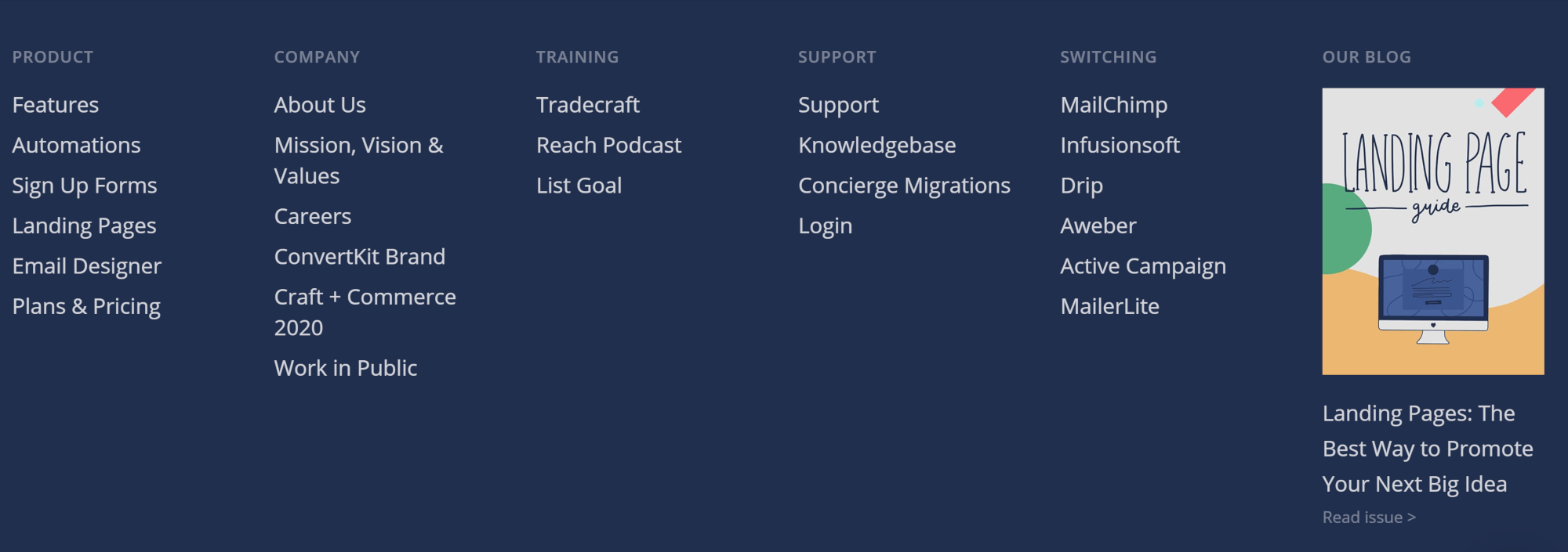
As you can see, they include links to product feature pages so visitors can find the feature they’re looking for quickly and easily. They also include a lot of company information, links to specific training, support links, and links on how to migrate from different companies. There’s a lot of great information in their footer, which enhances their brand.
In Conclusion
Putting together a quality homepage takes some time and effort, but it’s time and effort well-spent. Plus, it’s something you only have to spend the time on once. A well-designed homepage will help draw in new customers and keep older ones. And it’s all done automatically at all hours of the day and night. It also will do the critical work of getting your business name out there. Invest the time when making your webpage now, and watch your business grow.
About the author
Lisa Parmley is an online course creator and entrepreneur. She has 19+ years of experience running a digital training business and lives in Denver, CO. Lisa writes about starting and scaling online course businesses and interviews successful course creators at coursemethod.com.


Follow Lilach