


Follow Lilach
Increasing Website Traffic and Conversions: How to Use Color Psychology
As the number of websites vying for a customer’s attention keeps growing, brands are reaching for all kinds of innovative and creative ways to outshine their competition. From videos and augmented reality, to something as seemingly simple as the use of clever copy and the colors you select for your website, anything goes as long as it works.

In truth, the use of color psychology in marketing is nothing new, and marketers have been using it since the first color TV was invented. Today, there is some science available to back up our practices, and we know more about the connection between colors and behaviors than we did before.
Let’s explore color psychology for ourselves, and determine how the colors you use on your website influence your visitors, as well as how to use this knowledge to your advantage:
What is color psychology?
Colors strongly influence the way we feel about something. When we see a certain color, after this piece of information has traveled through our body’s vast neurological system, our glands start producing hormones that then impact our mood and emotions, ultimately resulting in a certain action or behavior.
Color psychology is then the study of how colors affect us and our emotions and reactions, aiming to examine these responses and connections. Some will claim it is no science at all, but we certainly can’t discredit the effect colors have on our emotions. In fact, if you pay attention to it, you will notice these connections yourself. Just take a look at the same object in different colors, and appreciate how you react to it.

As for the connection between colors and marketing, it’s clear to see: if we can impact the emotions and even to an extent the reactions someone will have based on the colors we choose to use in a marketing campaign or on a website, we can impact conversions. A study has shown that these tweaks with color (among other things) can increase conversions by over 20%.
Where should you use color?
Since you can use color practically anywhere on your website, let’s focus on a couple of key elements here: page backgrounds, images and videos, headlines, borders, buttons, and the like.
Also, bear in mind that we won’t be going into too much detail about the way to distribute these colors. That will be up to you and your web designer. Our general piece of advice is not to go overboard – yes, color is a great way to draw a visitor’s attention to a section of a page, but you should never crowd your pages with too much of anything, whether it’s elements or colors.
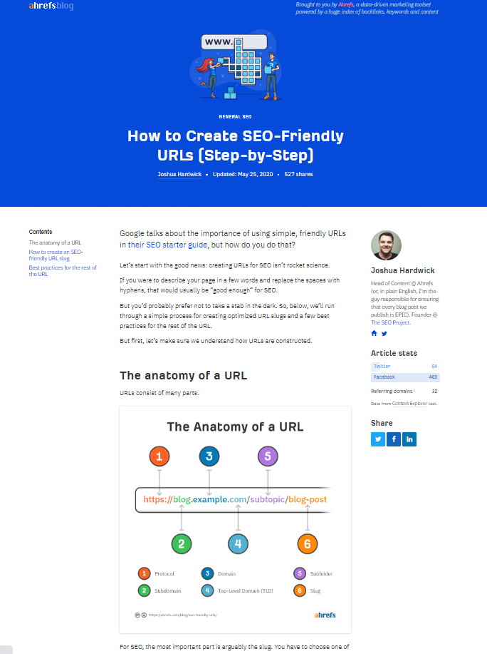
There are countless examples of the use of white space and a simple color palette in amazing ways. Here is one:
And one more:

Both Ahrefs and Hubspot use one main color (blue and orange, respectively) to accent different elements of their website. They also have plenty of white space that works incredibly well, making the website feel light and airy.
Cultural differences and how to work with them
Localization should play a very important part in your website design – and you should also adjust your color scheme to different markets. While most designers fail to take into account how different cultures view different colors, adjusting your website (even though it may seem like intentionally diluting a brand image) to a certain market can win you customers instead of losing them.
Here is an example: the color red is viewed as a positive color associated with happiness in most of Asia. In the western world, it can be interpreted as negative and aggressive. Much of the western world sees green as a color that promotes freedom and nature, while in Israel, green is associated with bad news. There are countries in the world where brides wear black, or where white is worn in mourning, so don’t dismiss these associations when designing a website for different markets.
Know your customer
Before we finally dive into actual color psychology and start exploring which colors evoke what kinds of emotions and actions, there is one final piece of information we need to part with.
No matter what you learn about the way different colors make people feel, never forget you need to consider your customer (and yourself as well).
For example, you may want to go with a specific shade of blue, which may be in line with the message you’re trying to send. Let’s say you run a sporting goods store. And that the majority of your customers are fans of a club that boasts red jerseys. And that their fiercest rivals wear blue. Will it still be an equally good choice?
We can’t answer that question – it is entirely up to you to think about not only the psychology of colors when designing your website, but your customer base as well. What do they like, what do they want, what are they looking for?
In that vein, here are some other pieces of information that may come in handy:
- Women tend to like blue, purple, and green, and dislike grey, orange, and brown.
- Men tend to like blue, green, and black, and dislike purple, orange, and brown
- Traditional buyers usually prefer colors like pink and sky blue, while impulsive shoppers are drawn to orange-ish reds, royal blue, and black.
Which color does what?
Now let’s look at the ways in which different colors impact emotions and actions:
Red – the color of energy and attention
Red is considered the color of passion and is connected in color psychology with several quite different things: love, blood, joy, and suspense. It is the color of emergency and immediacy, which is why it is great for drawing attention to special prices, discounts, and important notices.
Of course, you can still use red as part of your logo. But we’d advise against using it all over the website, as it might make visitors feel uncomfortable.
Orange – the color of fun
Orange is associated with warmth and joy, as well as optimism and positivity, so it’s a great choice if you are looking for that upbeat and vibrant feel of a website. It can be a bit too bright, so make sure you do use it sparingly and as an accent, more than all over the place.
It is used by plenty of sports teams and is usually simply associated with a good time and a fun-loving atmosphere, so if you are marketing to kids or a hip crowd, it can be the right choice. On the other hand, it might not work for a more conservative audience.
Yellow – the color of optimism
Playful and vibrant, yellow is another color associated with joy. However, if too bright, it can have the opposite effect and provoke negative emotions.
It is a way to signal notifications. Think about it: red lights mean stop, green lights mean go, and yellow lights mean get ready. In short, you’ll want to use yellow as a means of conveying messages.
All of these bright colors – red, orange, and yellow – are more suited for notifications and important elements of a web page, such as CTAs and contact buttons. Their more subdued and muted versions can be used in different contexts as well – in testimonials, contact forms, and other elements you wish to make more prominent.
Blue – the color of confidence
Blue is a color that inspires trust and loyalty. It’s often the favorite color of men, and it can be very soothing. This is why most websites choose it for their branding, as it tends to be universally liked and have a calming effect.
Going for a blue color palette and choosing different shades of blue in your design is your all-around safest bet. Just consider the companies that use blue: Facebook and PayPal, for example, as well as plenty of banks and other financial corporations.
However, if you are in the food market, stay away from blue. It will definitely not work well, as the color is known to curb appetites (dieters are encouraged to eat off of a blue plate), and may even be associated with poison.
Green – the color of growth
Green is naturally associated with nature, and it reflects growth and tranquility. It is considered the color of balance, as it is located in the middle of the color spectrum. But it’s also the color of the dollar, so it is often associated with wealth as well.
If your brand is eco-friendly, vegan, and generally green, using this color for your website and branding is the most natural choice.
You can also use green for your Add to Cart and Pay buttons, as it will promote a feeling of safety and security.
Black – the color of mystery
Black is often associated with evil and death, but in fact, it’s quite a neutral color that can have plenty of other meanings. It is mysterious and elegant, timeless, and even luxurious – and it will work well if you’re trying to exude sophistication and power.
Examples of the clever use of color psychology
What really matters in website design is cohesion and fluidity. That’s why the colors you choose need to suit each other well in terms of tone and opacity.
Let’s take a look at a few brands that have used color theory to their advantage:
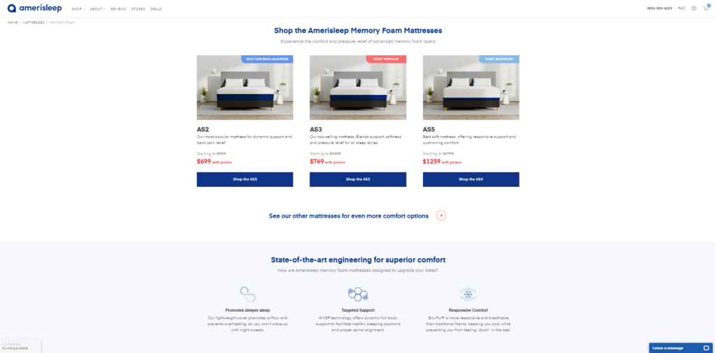
Here is a page from a brand that sells mattresses – they’ve chosen a soothing combination of blue and grey, which goes very well with the emotions they’re trying to evoke: lightness, sleepiness, and serenity. Grey is an excellent choice when you’re looking to do something other than white, but still remain neutral and light enough.
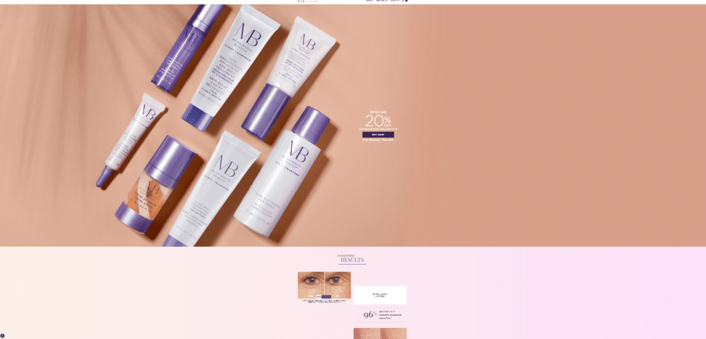
Here is a page from a brand that sells anti-aging cosmetic products – they’ve chosen to go purple and pink, evoking femininity and vibrancy, which lends itself very well to a sense of youth and vigor. The colors used on the website are the same colors that are used on their packaging, which ties in everything very nicely, and is always the best choice to make if you have a single line of physical products. You can also change your colors to go with a line of products you are currently promoting.
Here is a black color example from a website that markets luxury items. It looks incredibly sophisticated, rich, luxurious, and expensive. When used correctly, as it has been here, black can truly evoke a feeling of elegance and style. Of course, bear in mind that you never want to make the website too dark (for example, by having the background black and your words white, as this is very difficult to read and can even cause nausea).
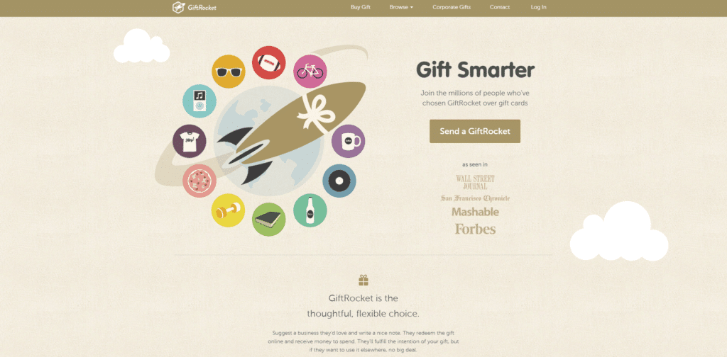
Finally, let’s look at a very neutral example that also works brilliantly – here is a brand that sells gifts. They have chosen this oatmeal color scheme that is mild, soothing, and a bit retro, but that is perfect for what they are trying to achieve. In other words, you don’t have to be afraid of neutrality. Greys, creams, and even off-whites can all do a brilliant job.
Final thoughts
Before you start designing your website, make sure you carefully think through your color palette. Naturally, you can change the design and color scheme of your website later on, but rather than risk being remembered for something and having to reteach your customers, try to select the best possible option early on.
Think about the message you want to send out to your customers, and more importantly, the way this message is aligned with your brand and what it can do for your customers. You don’t need to stick to stereotypes (and you can make an eco website non-green). You are, of course, welcome to think outside the box – but do have these examples in mind when considering your website’s coloring.
About the author:
Nick Kanter is a digital marketing strategist. He has worked with many leading companies around the world to increase their online visibility through search engine marketing.

Follow Lilach