


Follow Lilach

10 Top Real Estate App UI Design
The real estate industry is on the rise now; as a result, apps that help to rent or buy a house pop up like mushrooms after a rain. Actually, it’s not that difficult to build a real estate app, especially if you prepare yourself in advance. What do I mean?
There’s no need to reinvent the wheel — you can just analyze the experience of existing market players and take the most important lessons. For example, you can develop a real estate app UI design for your own project by looking at your competitors and combining their most successful solutions.
Let’s do it right now!
10 Top Real Estate App UI Design
# 1: Zillow
When it comes to creating your own real estate app design, this application can definitely be the source of inspiration.

With over 10,000,000 downloads only on Android, the Zillow application is one of the most popular services in the industry. So what are the most memorable Zillow’s real estate app UI design elements?
- Full-screen HD-photos and videos. Modern people want to see what they’re going to buy or rent right in the app and only if they are satisfied and have a good overall impression, to visit this house or flat.
- Wide filtering options. Despite this screen includes many options to choose from and can be hardly considered minimalistic, this is a necessary sacrifice to provide users with comprehensive info about real estate options in the area.
These are quite basic interface elements that will be useful as you design a real estate app for your own project.
# 2: Trulia
Trulia is another great application, which is owned by the same corporation as Zillow but still has quite a different real estate app design.
Its most popular feature is interactive map overlays that visualize how life goes in neighbourhoods: for example, where the crime rates are higher; what the average age, family status and education of locals are and so on.

By using different colours, shades and intensity to show different aspects of life in the neighbourhood, developers managed to make the exploration interesting and exciting on the one hand and extremely useful and informative on the other hand.
# 3: Homesnap Real Estate & Rentals
Another UI feature that became almost a “must-have” for all apps within the industry is virtual tours. There are plenty of examples of real estate app design that include 3D house tours, and the Homesnap application is one of them.
Unlike photos, a virtual walkthrough allows users to feel like they’re actually inside the house: they can look around, explore how the rooms are connected and check if there’s enough space to cover their needs.

To make this process even more comfortable, ensure an intuitive navigation pattern. It will eliminate all the excessive buttons from the display and provide users with the full-screen experience.
# 4: Rent.com
The 3D walkthroughs are great but how can you upgrade this feature? Take a look at the Rent.com app!
Along with HD virtual tours, users are offered to check 3D floor plans. It’s a pretty good idea since it helps users to envision the space without wasting time on visits.

Moreover, virtual floor plans aren’t a common feature of other real estate app designs so from the users’ perspective it can be considered as a unique advantage.
# 5: Owners.com
Don’t forget that you may use colours to navigate users and provide them with some useful information. Let’s see how it’s done in the Owners.com application:
- The main colours of the application are white and dark blue — this is a universal combination that doesn’t distract users and looks elegant & stylish.
- The green “Request info” button at the bottom of the description screen definitely draws users’ attention, encouraging them to take an action.
- Colourful bright tags on the map (green “new”, pink “open” and red “favourite”) are also used to emphasize specific characteristics of the property.
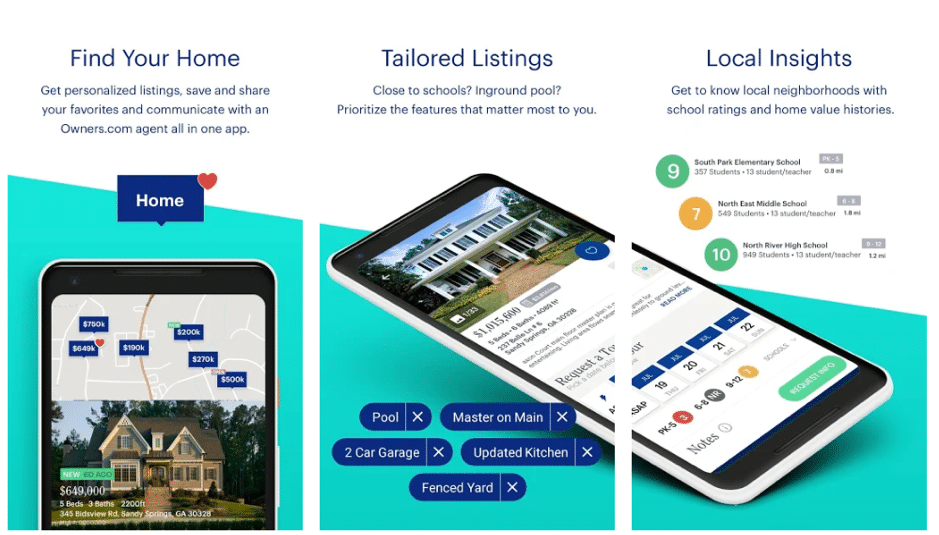
See? The Owners.com application is a perfect example of how you can influence your audience with no words or icons — just by using a specific colour scheme. Feel free to use this approach when you decide to design a real estate app.
# 6: Realtor.com
Realtor.com is another outstanding application which case you may find useful to design a real estate app of your own.
This app is a great example of you can use a clean and minimalistic design. For example, to replace text, where it’s possible, with icons (just take a look at the tab bar at the bottom of the screen).

Also, Realtor.com includes all the features that we’ve already mentioned: HD-photos and videos, interactive maps and 3D tours. Guys decided not to go the extra mile and it’s something to think over, too. Often it’s quite enough to match users’ expectations and not to exceed them.
# 7: Redfin Real Estate
If you like stylish products (just like the Stormotion team!), pay attention to the Redfin application. Moreover, do you remember what we’ve just said about matching users’ expectations? Redfin is one of the examples of real estate app design that fits this description!

With red & white minimalistic design, bright HD-photos, colourful tags and modern fonts, the app looks both attractive and convenient to use at the same time.
If your country or region misses this type of real estate application, it may be almost a ready-made solution for you.
# 8: Xome Real Estate Auctions
Xome’s real estate app UI design is interesting because it greatly relies on icons and images. As an auction app, it lacks such features as virtual tours and interactive map overlays, yet, the filtering feature is better than in many other applications.

By using custom icons (together with short word descriptions), developers improved the overall UX and made it easier to narrow down the search results. That’s something that we would advise you to reuse in your application as well.
# 9: LoopNet Commercial Real Estate
You should always remember that a good application not only looks nice but also has a clear and understandable structure. That’s exactly when the LoopNet app may become a source of good ideas for you.

Despite it can hardly be called the best real estate app design, it has some advantages:
- A mainly grey & white colour scheme that doesn’t distract users.
- There’s only 1 photo on the screen at a time, which also helps to concentrate on the offer itself.
- Screens are divided into segments, making it easier to perceive the information.
# 10: Homes.com
Finally, if you check the Homes.com app, you’ll find a feature that we haven’t met so far. In this application, it’s possible to see the property images right on the map after you tap the offer’s price.

It’s a convenient way to show your users how the house looks like without making them open the whole offer first. Thus, it improves the UX and overall impression of the app.
Takeaways
These were top 10 examples of real estate app design — each with some specific features that you can implement in your own application.
Be creative, use HD-photos and videos, provide users with virtual tours and 3D floor plans — these are just a few tips for you. The main one is that you should always put your customers first.
Good luck with your real estate app development!

Follow Lilach