


Follow Lilach

How To Leverage The Color Wheel For Your Business Cards
We underestimate the importance of color.
Whether we realize it or not, it influences our feelings, thoughts, and decisions on a daily basis.
Take shoppers, for example. In one study, 85% said that color was their primary reason for buying a product. On top of that, 66% of people won’t buy something if they can’t get it in their preferred color.
It’s even important on business cards.
In fact, experts have said that people will actually keep a color business card ten times longer than one that is monochrome. The idea that color is such an important factor in whether we choose to have something or not is a fact we don’t consciously consider.
But it’s actually vital, particularly when it comes to designing brand collateral (like business cards) that reflect your brand and provide a first impression to potential customers.
The key is choosing the right color.
This is so important as some color schemes can actively increase your chances of landing a new client or customer. And, as we mentioned before, colors also influence how people feel, so they can play a part in encouraging certain emotions or actions you want people to have or take when you give them your business card.
Step One: Get to Grips With the Color Wheel and How It Works
Color theory is one of the most basic parts of graphic design, and the color wheel fits into that. It basically provides a foundation for organizing color and helps you put colors together that are aesthetically pleasing.
You probably don’t notice when a design incorporates color theory, but you’ll certainly notice it when a design doesn’t. That’s the beauty of it.
Color theory is a fairly in-depth and involved topic, so for the purpose of this post, we’re going to focus specifically on the color wheel, which is one of the most integral parts of the theory.
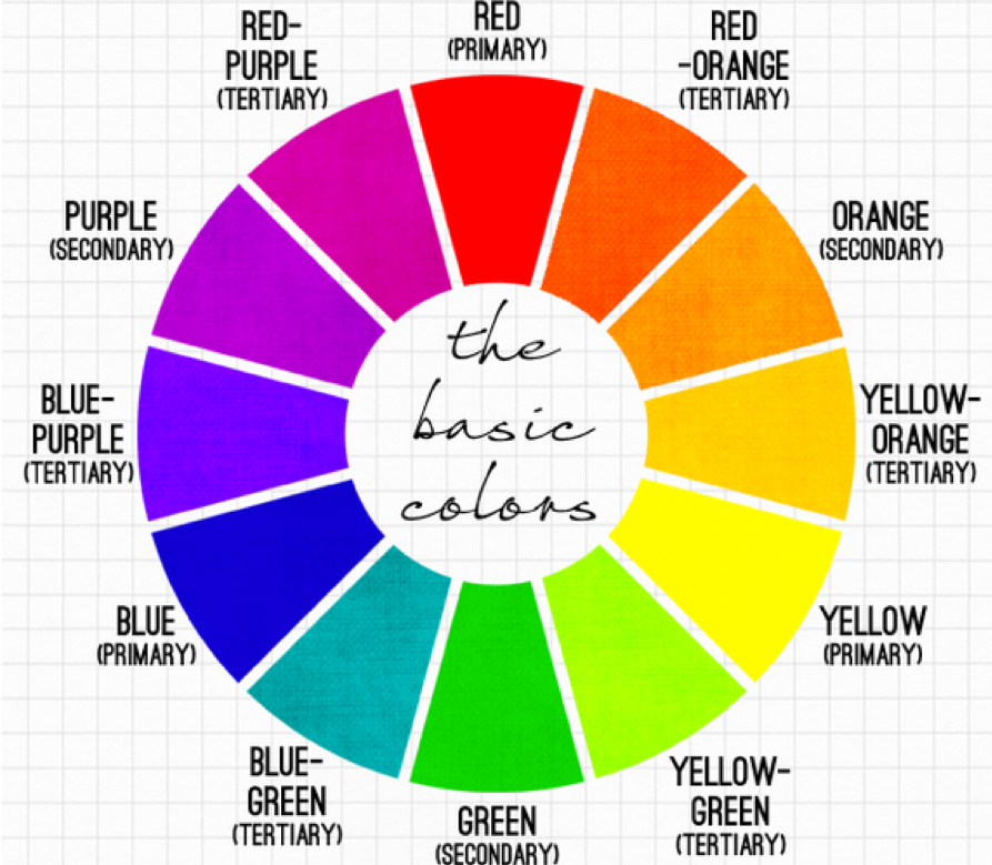
There are three different types of color combinations you can use the wheel to create:
- Analogous colors – this is when three colors next to each other on the wheel are used together
- Complementary colors – this is when two colors opposite each other on the wheel are used together
- Triadic – this is when three colors that are equally spaced around the wheel are used together
If you were to use blue, blue-green, and green together, you would be using an analogous mix of colors. If you use red-orange and blue-green together, you’d be using complementary colors.
Step Two: Understand Color Psychology
Colors are powerful.
If you don’t already have your brand colors set in stone, you can use color psychology to encourage recipients of your business cards to think and feel a certain way.
The key to understanding color psychology is knowing what colors evoke what feelings and how that is going to make you and your business look to potential prospects.
Here are the different feelings that different colors evoke.
Yellow – warmth and optimism. Think of the sun, which is often used to depict happiness and hope.
Orange – bold orange is often used to create a sense of confidence and cheer.
Red – the brightness of red is difficult to ignore, hence why it often comes across as bold and confident. On the flip side, it is also used to highlight warnings, so bear that in mind.
Blue – the calm color blue is used to denote feelings of strength, serenity, and dependability. A darker blue is often associated with the corporate world, which can work well for businesses that fall into this category.
Green – it’s no surprise that the color most associated with nature is often used to represent peace and health.
The key to using color psychology effectively is to consider the colors that most align with your business’ vision and what you want your recipients to feel when you hand them your card.
Do you want them to associate your business with strength and reliability? Then use blue. If you want them to feel happy and optimistic, maybe a yellow would be more appropriate.
Of course, there are different shades of each of these colors, so it’s worth playing around with them to determine which combinations create the feelings you want.
Step Three: Marry the Two Together
The final step in the process is bringing color theory together with your brand and business cards.
To do this, you need to know:
- What you want recipients to think and feel when you hand them your business card
- What your business’ values are and how you can reflect that with the use of color on your cards
- What message you want to send out about your brand with your business cards. For example, do you want to be seen as a fun company, a serious one, or a peaceful one?
Once you can confidently answer these questions, you can handpick the colors that align with these needs from the color wheel and through using color psychology.
From there, it’s a case of tying the colors into your other branding elements, like your logo, font, and the general design of your business cards.
The best way to find what works is to play around with color combinations and see which one stands out the best.
Colors Matter More Than You Think
It can be tempting to create a quick business card design and be done with it, but this can work against you. When you really consider the colors using color psychology and the elements of the color wheel, you can determine what you want to say with your business card – and, more importantly, actually say it.
If you do this, you can leverage more sales.
Start by using the color wheel to figure out which color combinations work best at representing the values of your business and then use Brandly’s visual business card designer to play around with your layout, colors, and other branding elements.

Follow Lilach